Monday, January 26, 2015

Mini Lesson: Free-Build

Create a spaceship using primative shapes, the toolbox, and the exturde tool

Polygon

  • Polygon Anatomy
    • Edges
    • Vertices
    • Faces

Polygon Primitive Objects

  • Sphere
  • Cube
  • Cylinder
  • Cone
  • Plane
  • Torus
  • Prism
  • Pyramid
  • Pipe
  • Helix
  • Soccer Ball
  • Platonic Solid
    • Dodecahedron
    • Icosahedron
    • Octahedron
    • Tetrahedron

Toolbox

  • Select Tool
  • Lasso Tool
  • Paint Select Tool
  • Move Tool: Vertex, Edge, Face
  • Rotate Tool: Edge, Face
  • Scale Tool: Edge Tool


Extrude

Wednesday, May 7, 2014

Blend Shapes

Adam_Blendshape

The Power of Blend Shapes

LEARNING TARGETS:
» I understand and can apply Blend Shapes to a given object for modeling or animation purposes
 
EXPECTATIONS:
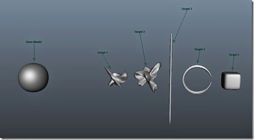
» Create a shape as a the base-model.
» Duplicate the base-model to create a target six times each time adjusting the shape
» Create a Blend Shape of all the new target models
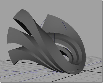
» Create a simple 5 second animation (Playblast) showing a ‘morph’ between all of the Blend Shapes. 
» Post an image of the shapes used, the Blend Shape Editor, and the final Playblast
 
 
 BlendShape-1
 
- After creating all the target shapes, select them in order that you want to be used.  I chose the targets from left to right and then selected the Base-Model last.  Once selected, under the Animation Menu Set choose Create Deformers > Blend Shape.  Nothing seems to happen, but a Blend Shape was created. 
 
BlendShape-2- Now open the Blend Shape Editor  Windows > Animation Editors > Blend Shapes.  The Blend Shape Editor should open.  Now play with the sliders and the Base-Model should change to the correlating target.


Wednesday, April 9, 2014

Tuesday, March 25, 2014

SUB: 3/25/2014

Finish the screwdriver! http://www.3dstudents.com/2014/01/screwdriver-notes.html

Once the model is finished, light it with a three point lighting configuration as if it were on a stage.  I do not want to see a “spot light” ring; I want you to light the subject with soft edges.  Use the three point lighting tutorial for a review of lighting basics.   http://www.3dstudents.com/2014/01/light-lighting-3-point-notes-v4.html

We will be covering the next part, rendering,  in class next week. 

Otherwise they can finish any other project they are working on.  

Sunday, December 15, 2013

-- ADV 3D – Final Checklist --

Just a reminder, I will be attending the International Robotic Olympiad Monday – Thursday and will not be at school during these days. However I will be at school Friday if you need to speak with me before break.  Mainly you are to finish and prep all your work for the end of the semester.


You are to finish the following projects by the end of the semester:

  • Screwdriver Model
  • Screwdriver render
  • nCloth
  • The Cube
  • Deformers
  • Motion Path
  • Character Model Sheet.

pear_production_model_net

Link: http://3dlevel2.blogspot.com/2013/10/robot-concept-design.html

Sunday, November 17, 2013

3D Printing with Maya Notes

3D Printing Vocabulary

  • Additive Manufacturing
  • Manifold
  • Normals


Our printers:

Spec

Replicator 2

Replicator 2X

Material: PLA  -  1.75mm diameter ABS  -  1.75mm diameter
Material Characteristics: - Smell is barely noticeable

- Created from processing plant products including corn, potatoes or sugar-beets

- More rigid than ABS

- Much less part warping

Prone to curling of corners and overhangs


More brittle


- Low temperature resistance and parts spending the day in a hot car can droop and deform 

Extrude at ~180-200°C

-Lower layer heights and sharper printed corners.

-wider range of available colors and translucencies
-Smells bad

-Is a polymer, petroleum based 

-Preferred plastic by engineers and those with mechanical uses, do to its strength, flexibility, machinability, and higher temperature resistance  

Prone to cracking, delamination, and warping

More flexible

-Higher temperature resistance


Extrude at ~225°C

-Soluble in Acetone allowing one to weld parts together with a drop or two.  Parts can also be smoothed or polished with acetone


Build envelope: 285 mm × 153 mm × 155 mm
11.2 in × 6.0 in × 6.1 in


Basics for 3D Printing.

  • Output – STL file format
  • Thickness – 0.7 mm?

  • Open vs. Closed Surfaces

  • Interlocking Parts

  • Normals

  • Manifold vs. Non-manifold: Every edge must connected to at least two faces

  • Working Units for a scene in centimeters.

    • Default scene units are centimeters

    • Recommend grid display units.

      • Grid lines every: 1 units.

      • Subdivisions: 10 units.

      • Subdivision lines: Different color then the 'Grid Lines'

  • Maya is Y-up by default and the Makerbot printer is Z-up

  •  

Grid


  • Maya Plug-in Manager
    • Load
      • objExport.bundle
      • vrml2Export.bundle
  • Software
    • Makerware
    • MeshLab – great for converting 3d format types.
  • Maya Distance Tool
    • Create > Measure Tools > Distance Tool


  • Common Problems
    • Close up gaps
    • Fill holes
    • n-gons
    • Reversed Normals


  • Modeling Tips
    • ???? The physical model being printed cannot reach over 1.75 million polygon count. The  general range you are looking for, is around 1 - 1.5 million polygons. If the model is over 1.75 million polygons , please consider retopologizing. Topogun is great for this.
    • Combined vs. Boolean
    • Combined all geometry
    • Triangulate all models, so you don’t have non-planar surfaces
    • Make all edges “Hard”,  so you can see the way your model will actually print.
    • Ensure base is flat
    • Must be a closed object.  Water Tight!
      • Turn on the “borders” of your polygon model to verify.  If you see border edges, then your model is not water-tight.  Display > Polygons > Custom Polygon Display Polygons
    • Convert all NURBS and Subdivs to polygons

Prepping Model

  • Convert your model into polygons,
  • Make sure your model is “water-tight”
  • Triangulate and view with Hard Edges
  • Export into a .stl file

Monday, November 11, 2013

Thingiverse

LEARNING TARGETS:
»  I understand the purpose of www.thingiverse.com and can describe its features and potential
»  I understand the responsibilities and ethics associated with publishing to the internet
 
EXPECTATIONS:
»  WRITE: In your blog, define the purpose of www.thingiverse.com and describe its features and potential
»  WRITE:  Find 5 super cool “things” and document in you blog, including images. 


thingiverse

Tuesday, November 5, 2013

Deformers

LEARNING TARGETS:
» I can apply non-linear deformers to objects for modeling purposes
 
EXPECTATIONS:
» Create a basic set-up 3 cubes with heavy divisions to allow bending and save as base-model
» Apply each non-linear deformer individually, post in your blog, and describe what each deformer does.     ***You should have SIX images in your blog, demonstrating each of the deformers
» Create TWO  “VERY COOL” models, “stacking” deformers, each model should have multiple deformers

Create 3 Cubes with HEAVY divisions in all three axis (X, Y, Z).  Go to history (Inputs) for the cube and change the cubes sub-divisions and height.
Capture32 Capture33
 
 
Combine cubes MESH > Combine.

2010-11-19_0924
Create SIX models applying SIX different deformers, Bend, Flare, Sine, Squash, Twist, and Wave.
Switch to the Animation Menu Set {F2}
Select the combined object and apply a deformer. Create Deformers > Non-Linear Deformers > Bend  for example.

Save each model and take a screen shot for each. Write a brief description of each deformer.

Then create TWO more models applying multiple deformers to different shapes.
Make sure you add tons of divisions to objects that you make.
Save all models and take a screen shots.
Post each on your blog.

You should have 7 images in your blog.

Here is an example of multiple deformers:
2010-11-19_0942

LIGHT: Lighting 3-Point Notes v4


LEARNING TARGETS:
»   I  can light a subject with a simple 3-point lighting  configuration.
»   I can implement 3D text in Maya
 
EXPECTATIONS:
» 
» 


Watch video on 3-point lighting.  http://www.youtube.com/watch?v=AcMX1RcNRYA
 
 New_New_3-point-light

Overall Goal, post 4 renders to your blog: 1-point Lighting, 2-point Lighting,  3-point Lighting, & Final Render

General Steps for Key Light:

Overall Process
  • Setup initial scene.
    • Irregular sphere
    • Plane
  • Create and adjust Lights
    • Create and adjust Key Light
      • Render scene and save final image.
    • Create and adjust Fill Light
      • Render scene with both Key and Fill Light and save final image.
    • Create and adjust Rim Light 
      • Render scene with both Key and Fill Light and save final image.
  • Look at overall scene and adjust all lights for final render.
    • Tweak the render settings to improve quality
      • Shadows
      • Render settings
  • Post final images and label them in blog.
    • 1-Point Lighting
    • 2-Point Lighting
    • 3-Point Lighting
    • Final Render

    Three Point Lighting

    What is a 3-point lighting system and why are we learning it?  It is basically a lighting technique that was created to simulate real world lighting in a studio environment in Hollywood. The Three Point Lighting Technique is a standard method used in visual media such as video, film, still photography and computer-generated imagery. It is a simple but versatile system which forms the basis of most lighting. Once you understand three point lighting you are well on the way to understanding all lighting.

    A classical 3-point lighting scheme has three lights, a key light, fill light, and rim light.


    Setup
    • Create a plane as the ground  and sphere as the main subject.  Set the sphere on the ground.  I made the plane HUGE.
    • Select your sphere and in vertex mode randomly select, using constraints, a small percentage of vertices scaling them out.

    Something Like this:
    Capture50

    Capture57Select your polygon sphere.  Open the Select > Select Using Constraints menu and select  Current and Next.  Then under the Random Tab, check Activate.  Now you can use what ever ratio you want, I used 0.2  Using this tool, will randomly select vertices of a given object.  Now every time you select all the vertices, you will randomly select 20% of the objects vertices.  
    Now select all the vertices on the sphere, notice it randomly only selects 20% of the vertices.  I then scaled the vertices out. 
    Capture58 Capture59    

    I repeated this a few time scaling both in and out.   Then I activated the smooth preview and got something like this.
    Capture60 Capture61

    Capture51 

    Set Render to Mental Ray:  Open render settings and change render using . . . Switch to Mental Ray. If it does not appear, activate it by: Window > Settings/Preferences > Plug-in Manager > then check the boxes for Mayatomr.mll.
    CAMERA
    Create Key Camera: Create > Cameras > Camera then while each camera is selected in one of the perspective view choose Panel > Look through Selected. Also label the camera “Render Me” Manipulate each camera accordingly.

    Untitled-1Now you should be looking through the camera labeled “Render ME”. We need to add one more thing, show resolution gate. There are two ways to do this. View > Camera Settings > Resolution Gate or press the resolution gate button.


    COMPOSTION
    When rendering, composition must be considered, since it is your final output. Composition is very subjective, and honestly, there is no formula for art.  With that said, there are some that help guide you to understand better composition.  The two main compositional aides that we will focus on is “rule of thirds” and movement.   *Movement is a Principle of art.
    An artist uses a visual sense of motion through their work to create movement.  There are many ways that this can be done, generally the Elements of Art are visual tools that are used to direct the viewer throughout an artwork.  They consist of line, texture, form, space, shape, color, and value. MORE NEEDED HERE

    LIGHTS
    *First, I want to note that Maya has a default light that is always on until you create a light and then the default light is then turned off.  You do not need to, but you can turn off the default light in the Render Globals → Common Render Options and then uncheck Enable Default Light.  The default light may will explain why the scene may drastically change when you add your first light. 

    ADDING LIGHTS
    Spotlight
    There are a number of attributes you will need to control the spotlight.  Here are the most important:


    Changing Decay Rate
    Changing Decay Rate controls how quickly the light’s intensity decreases over distance.  The default setting is No Decay.  I generally try to similar real world lighting, hence I use Quadratic Decay.
     

    No Decay - no decay; light reaches everything

    Linear - light intensity decreases directly (linearly) with distance (slower than real world light)

    Quadratic - light intensity decreases proportionally with the square of distance (the same as real world light)

    Cubic - light intensity decreases proportionally with the cube of distance (faster than real world light)

    Changing-Cone-AngleChanging the Cone Angle 
    The Cone Angle setting changes the angle (in degrees) from edge to edge of the spot light’s beam. The valid range is 0.006 to 179.994. The default value is 40.   The advantage of changing the Cone Angle is that you do not have to adjust your intensity versus when moving the light farther or closer.  *This does is irrelevant if “No Decay” is set on your spotlight. 
    Changing-Penumbra-Angle
    Changing the Cone Angle
    The Penumbra Angle setting changes the edge of the spot light’s beam by widening the Cone Angle  in degrees.  The intensity of the light falls off linearly to zero. The valid range is -179.994 to 179.994.  The default value is 0.

    Changing-Dropoff[3]Changing the Dropoff
    The Dropoff setting controls the rate at which light intensity decreases from the center to the edge of the spot light beam. The valid range is 0 to infinity. The slider range is 0 to 255.   Typical values are between 0 and 50.   The default value is 0 (no dropoff).


    One Point Lighting  and Key Lights
    The key light is the main or the strongest light in the scene that illuminates your subject.   It  is also responsible for the over all exposure and defines the most visible shadows.  It could be from any main light source from the sun penetrating in a window sill to the spotlight on a stage. In a classical 3 point lighting setup. it is generally placed 30 to 45 degrees to the right or left of the camera. This range for the key light helps bring out more texture and form (dimension) in the subject.

    Here is an example of a model with 1-point lighting. She is only lit with a “key” light.

    New_1-point light
    Here is a 1-Point setup with the abstract shape.  The light is essentially in the same location as the models but our shape is completely different and captures more light.

    Create Key Light: Create a spot light Create > Lights > Spot Light then while each light is selected in one of the orthographic views choose Panel > Look through Selected. Also label the light“Key Light” then Manipulate each light accordingly placing it about 30 to 40 degrees to to left or right of the camera.
    SHADOWS There are two main choices for shadows Raytrace and Depth Map.  Depth map shadows and ray traced shadows produce similar results, Capture52though depth map shadows usually take less time to render. Maya documentation suggests to choose depth map shadows unless they cannot accomplish your visual goal; I disagree.  The quality and control is more superior with Raytraced shadows and that is what I generally use.   


    On your main light, the "Key light,” activate Ray Traced Shadows, check Use Ray Traced Shadows, and change the light radius to somewhere between  1–10, (it could be lager or smaller) it all depends on the scale of the  scene and  the distance the camera is from the main objects.   The shadow rays adjusts the quality of the shadow.  This can drastically slow down your render times.    I tend to start with at least 10 and increase it to may 40 for the final render.  This will remove the “grittiness” in the shadow.


    • Light Radius
      – This defines the area from which the light is coming. The larger the Radius, the softer our shadows will be.
  • Shadow Rays – Increasing this will increase the samples of our shadow quality, but will also increase our render times.
  • Ray Depth Limit – Is the limit of how many times the light ray will bounce from one surface to another.

    1st Render – One Point Perspective: Key Light with ray traced shadows.

    Save render as 1-Point_Perspective and make sure you change it to a JPG format.
    • Post render in Blog.

    KEY LIGHT with FILL LIGHT
    The fill light should be able to reduce and control the amount of shadows created. The idea is not to totally remove the shadows but to maintain a good ratio between main light and fill light. Different ratio gives you different feel so you have to do a lot of experimentation.  The fill light helps fill the shadows that the main light casts, basically it simulates the ambient light .   NEEDS MORE

      Here is an example of a model with 2-point lighting. She is lit very evenly with both a “key” light and a “fill” light.


    New_2-point light 
    Here is a 2-Point setup with the abstract shape.   The “key” light has not changed from the 1st render.  The “fill” light softly fills in the shadows made by the “key” light. 

    Create Fill Light: Create a spot light Create > Lights > Spot Light then while each light is selected in one of the orthographic views choose Panel > Look through Selected. Also label the light“Fill Light” then Manipulate each light accordingly placing it about 30 to 40 degrees to to left or right of the camera.

    Fill Light Shadows On your "fill" light, activate ray traced shadows, check Use Ray Traced Shadows, and change the light radius to about 10 , it can be anything, but the objective is to soften the shadows from this direction.   The shadow rays adjusts the quality of the shadow. This can drastically slow down your render times. I tend to start with at least 10 and increase it to may 40 for the final render.   This will remove the “grittiness” in the shadow.

     
    2nd Render – Two Point Perspective: Key Light with ray traced shadows.

    Save render as 2-Point_Perspective and make sure you change it to a JPG format.
    • Post render in Blog.

    KEY LIGHT, FILL LIGHT and RIM LIGHT

    Classic three point lighting set up.
    New_3-point light
    Here is a 3-Point setup with the abstract shape.


  • 3rd Render – Three Point Perspective:
    Key Light with ray traced shadows.
    Fill Light with Soft ray traced shadows.
    Rim Light with Soft ray traced shadows.
    Save render as 3-Point_Perspective and make sure you change it to a JPG format.
    • Post render in Blog.
    Rim Light Shadows On your "fill" light, activate ray traced shadows, check Use Ray Traced Shadows, and change the light radius to about 10 , it can be anything, but the objective is to soften the shadows from this direction. The shadow rays adjusts the quality of the shadow. This can drastically slow down your render times. I tend to start with at least 10 and increase it to may 40 for the final render. This will remove the “grittiness” in the shadow.


    4th Render – Three Point Perspective Final Render:
    Key Light with ray traced shadows.
    Fill Light with Soft ray traced shadows.
    Rim Light with Soft ray traced shadows.
    Save render as 3-Point_Perspective and make sure you change it to a JPG format.
    • Post render in Blog.


    This is what it look like from the top view.  The lights are not really setup the way we want them to be, we will change this in a bit.  This is just the initial setup.

    Label all the lights:  Key Light, Fill Light, & Rim Light.

    Turn off both the Fill and Rim light:  Select each light and in the Attribute Editor change their Intensity to 0.
    Capture49 
    FINAL RENDER     3-Point Lighting

    CREATIVE LIGHTING

    Two Point lighting: Hard “Key” light from the right side and hard “Rim” Light from the back left. Ambient light slightly revels the subject.


    Two Point lighting: Hard “Key” light from the right side and soft warm  “Fill" Light from the front left.


    Soft cool textured light.


    1. All the lights were hard sources and upstage for this shot.
    2. One Lupo 800 light was all I used plus a bit of magic. Continuous light is perfect for this kind of effect because what you see is what you get. White balance was 3800k.
    3. We then broke off from f/16 and opened up to f/2.8 for a bit of a shake up. The light here was daylight coming through my open door in the studio.
    4. Next it was time to shoot the same corner with continuous light. The Lupo 1200 provided the slash of light while the Lupo 800 was warming up as an area flood. The warm up period gives a green light, it soon passes to reveal pure white light.
    5. Pop the white balance to 2600k for a bit of blue action
    6. One Lupo 800 light was all I used plus a bit of magic. Continuous light is perfect for this kind of effect because what you see is what you get. White balance was 3800k.

    New_3-point-light-2


    Great Rendering Article.
    http://www.fxguide.com/featured/the-art-of-rendering/


    Talk about indirect lighting.
    In our case, the main light source is in the ceiling. Look at the top your hand, why is the bottom of your hand not completely in the shadows?
    Reflecting
    Light is a transverse, electromagnetic wave that can be seen by humans.
    The photon the basic "unit" of light
    Any light that you see is made up of a collection of one or more photons propagating through space as electromagnetic waves. In total darkness, our eyes are actually able to sense single photons, but generally what we see in our daily lives comes to us in the form of zillions of photons produced by light sources and reflected off objects. If you look around you right now, there is probably a light source in the room producing photons, and objects in the room that reflect those photons. Your eyes absorb some of the photons flowing through the room, and that is how you see.
    For instance, a photon in the visible spectrum would contain an energy of approximately 4 X (10 to the power of -19) joules Thus, a perfectly efficient 100-watt light bulb would emit approximately 2.5 X (10 to the power of 20) photons per second.

    HDRI image
    If I put a chrome ball in a black room, what would it look like? Reflective material is directly dependent on the environment.

    Wednesday, October 23, 2013

    Project Design Journal (PDJ) – Part 1: The Interface


    LEARNING TARGETS:
    »   I can use computer graphic tools and design processes to help me develop, new original ideas.
    »   I can create a blog using Blogger.com to communicate my project ideas

    »   I can completely customize a blog for aesthetics, organization, & smooth navigation 
    »   I can create a custom organization system with smooth navigation using “labels” & “Pages" 
    »    I understand the responsibilities and ethics associated with publishing to the internet

    EXPECTATIONS:
    »   Create a blog using blogger.com to be used as a “Design Folder”.
    »   Create a clear organizational system using labels & pages for the following areas.  Use these for the page names: OVERVIEW, INITIAL RESEARCH, DESIGN, PLAN, CREATE, and FINAL PROJECT.  Use these for the label names: Overview, Development Journal, Concepts, Plan, Creation Process , Reflection, and Final Project.»   Create a new “test” post for each label.  
    »   Remove the “About Me Gadget”  
    »   Remove the “Blog Archive” 
    »   Turn off the Navigation Bar or Navbar 
    »   Create a custom header image that reflects your project theme
    »   Assign every post an appropriate label.


    Design Folder - Project Design Journal (PDJ)


    The design folder is a compulsory component of MYP technology. As students progress through the different stages of the design cycle, they are constantly experimenting with ideas, researching topics, compiling sources, brainstorming issues, sketching possible solutions, making changes, rejecting proposals and critically evaluating their work. All relevant activities and outcomes should be recorded, and dated, in the design folder.

    The design folder is a compilation of evidence that accompanies the final product/solution for a unit of work. Students formally record the results of their research, their various plans and designs and the evaluation of their finished products/solutions in the design folder. The design folder must be clearly divided into: investigate, design, plan, create, evaluate. It must begin with the student’s investigation and end with the evaluation. (The International Baccalaureate®)


    Refer to my example: http://godevo.blogspot.com


    Project Design Journal (PDJ) Setup Notes:

    Requirements:

    CREATE: Create a blog through www.Blogger.com using a “simple” template and choose one of the basic initial color scheme.  You can always change it later to fit your theme.

    DESIGN:  Design a header image in Photoshop with the following criteria: 940 pixels wide and about 160 pixels in height. The height should be no larger than 300 pixels. 

    Header9402_thumb1


    DESIGN:
    Apply  a color scheme that reflects your project theme. Explore different color schemes that compliment you main header image.

    CONFIGURE: Change the following settings to your blog. 

      • Set blog width to 960. Set your right side bar to 260.  You can do this by selecting Layout > Customize > Adjust Widths.  
      • Turn off Navbar  << Show Me How >>
      • Remove the “About Me” gadget
      • Remove the “Blog Archive” gadget
      • Configure Blog Post Settings   << Show Me How >>
      • Create a static “Home” page.  This sets your “Home Page” or the first page you will see, to an address of your choice. << Show Me How >>
      • Make Private? Your Choice???  Change Settings: Settings:Posts and Comments  << Show Me How >>
      • Remove “Showing posts with label *******, Show all posts” << Show Me How >>
      • Remove “Subscribe to: Posts ( Atom )“  << Show Me How >>

    CREATE:  Add a sidebar gadget containing a checklist link.  << Show Me How >>

    CREATE:  Add a sidebar gadget containing a table of contents.  << Show Me How >>

    CREATE: Create a top tab based organizational system for your PDJ. It must be clearly divided into: Overview, Development Journal, Concept, Plan, Creation Process , Reflection, and Final Project.   << Show Me How >>


    Use the following format for the linked web address: http://YourBlog.blogspot.com/search/label/Overview


    Tuesday, October 15, 2013

    Robot Concept Design

    LEARNING TARGETS:
    »  I can use computer graphic tools, graphic organizers, and design processes to help develop ideas,
         topics, or possible solutions for a concept design- Pinterest, Inspiration, etc.
    »  I can create thumbnail sketches of potential designs

    »  I can create a mind map to organize my thought and ideas
    »  I can concept my ideas / designs visually, on paper or digitally
    »  I can create a character model sheet
    »  I understand the responsibilities and ethics associated with publishing to the internet
     
    EXPECTATIONS:
    »  WRITE: Identify and re-write the task or problem (in your own words)
    »  SKETCH: After reading the problem / prompt, take out  a clean piece of paper and sketch and/or write-up your initial thoughts and ideas.
    »  RESEARCH: Collect /research reference images, current designs, inspirational, blueprints etc. (Pinterest, folder)
    »  ORGANIZE: Create a mind map that will help guide you with your design (3+ main branches, 1 branch for each design)
    »  SKETCH: Create Thumbnails sketches of possible robot designs (1+ pages for each design)
    »  CREATE: create an Influence Map for your main design
    »  SKETCH: Create 3+ detailed sketches based on your thumbnails, specifications, and mind map.
      (maybe multiple pages)

    »  DRAW: Create a finished character model sheet for your design (with orthographic views)
    __________________________________________________________________________

    »  MODEL: Create a quality 3D model – designed for print
    »  RENDER: Render a number of views with materials and lighting to showcase your model
    __________________________________________________________________________

    REFLECT: You are to create a blog using blogger.com to be used as a “Design Folder”
        for all your research
    (use all “Design Folder” requirements)


    THE ULTIMATE GOAL

    You are to create a finished Character Model Sheet for a original robot design to be showcased at the 2014 Robot Convention Hosted by Wings Over the Rockies. 
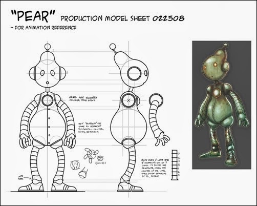
     

    pear_production_model_net


    PROJECT BACKGROUND

    You are a concept artist trying to break into the industry, your goal is to make an INCREDIBLE Robot 3D Model to be showcased at the 2014 Robot Convention Hosted by Wings Over the Rockies.  

    Time: 12 weeks
    Subject: Concept Design and 3D Modeling
    Client: Colorado Robotic Convention


    INVESTIGATE

    WRITE: Before you do anything, you must fully understand what the task is , so that you are heading in the right direction.  You don’t want to start creating a project and realize that it is not answering the task and you were assigned.  (Assign a label of ‘TheProblem’)


    SKETCH: After reading the problem / prompt, take out  a clean piece of paper and sketch and/or write-up your initial thoughts and ideas. Scan and post in your Initial Research.  (Assign a label of ‘InitialResearch’)


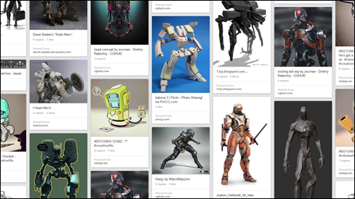
    RESEARCH: Collect /research reference images, current designs, inspirational, blueprints etc. Basically find as many as you need, which is at least 20+.  I call this phase, the “Virtual Cork Board”.  I have found that the best way to do this is to create a Pinterest page with all your resources.  This is not only a dynamic collection of resources, but it also retains the source information for later documentation.  (Assign a label of ‘InitialResearch’)

    Here is a cool Pinterest pinboard example . . .  <<  Here  >>

    Yon need to get inspired!  This is one of my favorite stages.   Basically you explore what is out there and possible directions you can go.  ~Cornell

    Pinterest.com
    Capture

    Click for another cool example.


    ORGANIZE: Create a mind map that will help guide you for the prompt / problem.  Create a mind map that explores 3+ design options for the project. Each design branch should fully explore design characteristics and specifications.  (Assign a label of ‘InitialResearch’)

    Create a mind map that will help guide you with your robot design. (3+ main branches, 1 branch for each design)


    Transmedia Narratives - Characters - Roles and Archetypes


    Wow, this is a really well developed character mind map.
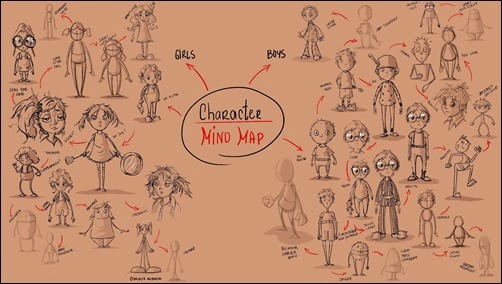
    Character Mind Map


    TIP:
    Most firms that hire you, expect you to go above and beyond what they are looking for.  First, it is important to give them exactly what they want, but also to share your expertise.  So if you come up with an idea that might not completely follow their specifications, share it with them.  They might not use it . . . this time . . . but your input as a design is invaluable. 

    (Optional) If you come up with a great design that might not fully meet the specifications completely, share it with them anyways.  Create a 4th branch with this optional design. 


    SKETCH: Design several thumbnail sketch pages of possible product design.  For each possible design, create a page of thumbnail sketches based on each of your designs from your idea map.  (Assign a label of ‘Design’)

    Here are some thumbnail examples, some are more elaborate than others.   Don’t be intimidated the examples, these are just supposed to be light sketches. 

    Examples

    bots_thumbnails


    SKETCH: Create 3+ detailed sketch based on your thumbnails, specifications, and mind map.  Basically you are draw 3+ detailed sketches where are more detailed version of your best thumbnail designs. You may have multiple pages . . .

    Here are some thumbnail examples, some are more elaborate than others.   Don’t be intimidated by these examples, these are from professionals or post-secondary students. 


    Influence Map:

    Create an influence map for your robot design, this should be a series of images that influenced and/or inspired you.  This should not be limited to images; it could be videos, text, music, people, video games, art, basically anything.  Also do not limit yourself, if you need more than one page go for it.  This is a fun investigative stage, so really spend some time researching.  ~Cornell

    QUOTATION:
    As an artist you are influenced by things. The reason why you do what you do is the combined application of all the things that influence you. If you run into a major block and cannot create new work, chances are you are forgetting what inspires you and need a refresher. Fill in these squares with everything that influences and inspires you to fuel the art you love to create. Refer to it as a Kind of “map” in the future case you get lost. 

    You can literally put in anything in these squares – photos of locations or people, other artist’s work, artists themselves, video games, TV shows, music, movies and books. You name it; you can put it in there. Fill the grid placing more prominent influences as larger images. ~ Fox-Orian (fox-orian.deviantart.com)
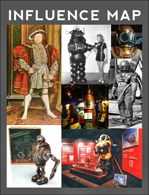
     

    Influence Map Henry the 8th Robot


    Here is a Influence Map Template adapted from Fox-Orian (fox-orian.deviantart.com)

    Influence Map


    The Influence Map Template has multiple size image boxes, 3 X 4, 4 X 5, and 5 X 6.  It also has custom boxes that are fully adjustable, which lay on top of the existing image boxes. 

    ScreenShot


    Character Model Sheets:

    Create a finished character model sheet for your robot design

    It should include:

      • 3/4 View and/or Action shot (Perspective)
      • Front Orthographic View
      • Side Orthographic View
      • Top or Back Orthographic View (depends on design)
      • Appendages
      • BIO Brief


      Character Model Sheet with BIO Brieffinal_FA_2


    Character Model Sheet 861_max


    Orthographic Image Sheet.  Notice the arm is separate, so you can see what the body looks like under the arm.  
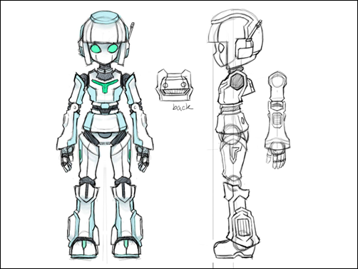
    android_girl_character_sheet_by_kouotsu


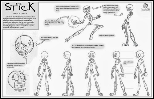
    jack_steele___model_sheet_01_by_flamingo1986-d4ghilx

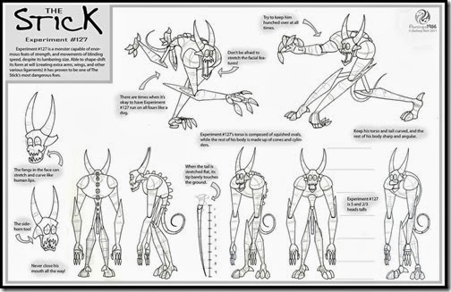
    the_beast___model_sheet_01_by_flamingo1986-d4ghizo